Grow Your Local Business: Create A Landing Page

Landing pages are the on-screen equivalent to your best elevator pitch.
A landing page is a page within your website that internet users ‘land’ on after clicking a link that’s related in some way to your business.
They might have clicked on a Facebook or Google ad, conducted a Google search or clicked a link on your blog or someone else’s blog.
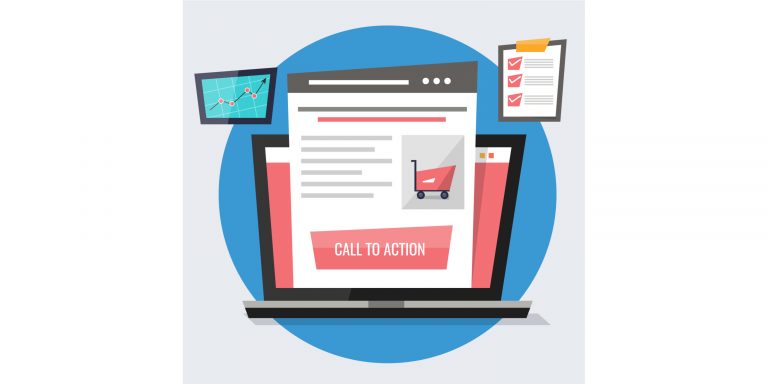
The purpose of a landing page is to encourage conversions within your sales funnel. Landing pages are designed to have one focused objective—known as a CTA. The objective is to get your visitors to take a desired action, such as download a voucher and redeem it in-store, sign-up for a newsletter, buy your products or sign-up for your services.
If your objective is to get more customers for your business, you need to have a landing page that’s designed to capture traffic from people searching your area for products or services like yours.
Such a localised landing page will help to bring more traffic to your website, target prospective customers in your area and connect you with qualified local leads.
Here’s why it pays to have a landing page that will appeal to your local customers:
– Nearly one-third of all mobile searches are related to location, according to Google.1
– Nearly two-thirds of smartphone users are more likely to purchase from companies whose mobile sites or apps customise information to their location, according to Google.2
That means your landing page must include the address and map of your location or service area. You should use the name of the area in your heading and mention the name in your body copy. To make it even easier for people to find your business, add directions and the names of the nearby bus or train stations. You should also add local contact information as well as your opening hours.
You could also include testimonials from happy customers, a video walkthrough of your location and a description of the services or products that you offer.
If you operate from multiple locations, you should create separate landing pages for each site. You could do that by mentioning things or products and services that make them stand out. Google frowns on duplicate content so don’t be tempted to use the same content on different landing pages. That will likely result in a drop in your search results in every local search.

Get Started
Your CTA should clearly describe your offer. Make your CTA specific, revealing some details that will encourage visitors to act.
Make it contrast with your website’s colour scheme so that it stands out on the page.
Colour matters. Strong, contrasting colours generally outperform colours that blend in with the theme of the page. BMI airline, for instance, increased its conversion rate by 2.5% by adding a red background behind the message ‘Hurry! Only XX seats left’.[1]
Perform A/B Testing on Your Landing Page
You might think you’ve created the best performing landing page, but you won’t know for sure until you’ve conducted what is known as a split test on the page. A split, or an A/B test, is a method of conducting controlled, randomised experiments with the goal of improving a website metric—in this case, conversions.
With a split test on your landing page, you compare the original version of the page (the control) against an almost identical version of the page (the test version). There will only be one difference between the two pages such as the headline. For example, you could use a different:
– Offer
– Headline
– Body copy
– CTA (colour, placement and wording)
– Image (size, placement, etc.)
– Font and type size
– Colour (of type, background, etc.)
– Testimonial or many testimonials
– Video
– Video length
– Trust symbols (such as Verisign)
Visitors to the page will either see the control or the new version. When the test is complete, the best performing of the two pages then becomes the new control. You then test another element of the page.
It’s vital that you only make one change because the two versions are going to go ‘head to head’. If the test beats the control, it becomes the new control—and you’ll know why: it’s because that one change was a marked improvement.
The aim is to continue tweaking the page to get the best possible response.
You can keep testing, and keep logging the results, and you’ll start to know what works and what doesn’t. Then over time, you’ll slowly edge towards that perfect version—the control that is unbeatable.
There are many split or A/B testing tools available online that will manage this process for you. Many charge a premium, but you can also use Google Analytics Experiments which is free.
1. Google Internal Data, Google Internal Data report, https://www.thinkwithgoogle.com,
April 2016
2. ‘Rising Consumer Expectations in the Micro-Moment, Google/Ipsos Connect, https://www.
thinkwithgoogle.com, December 2016
